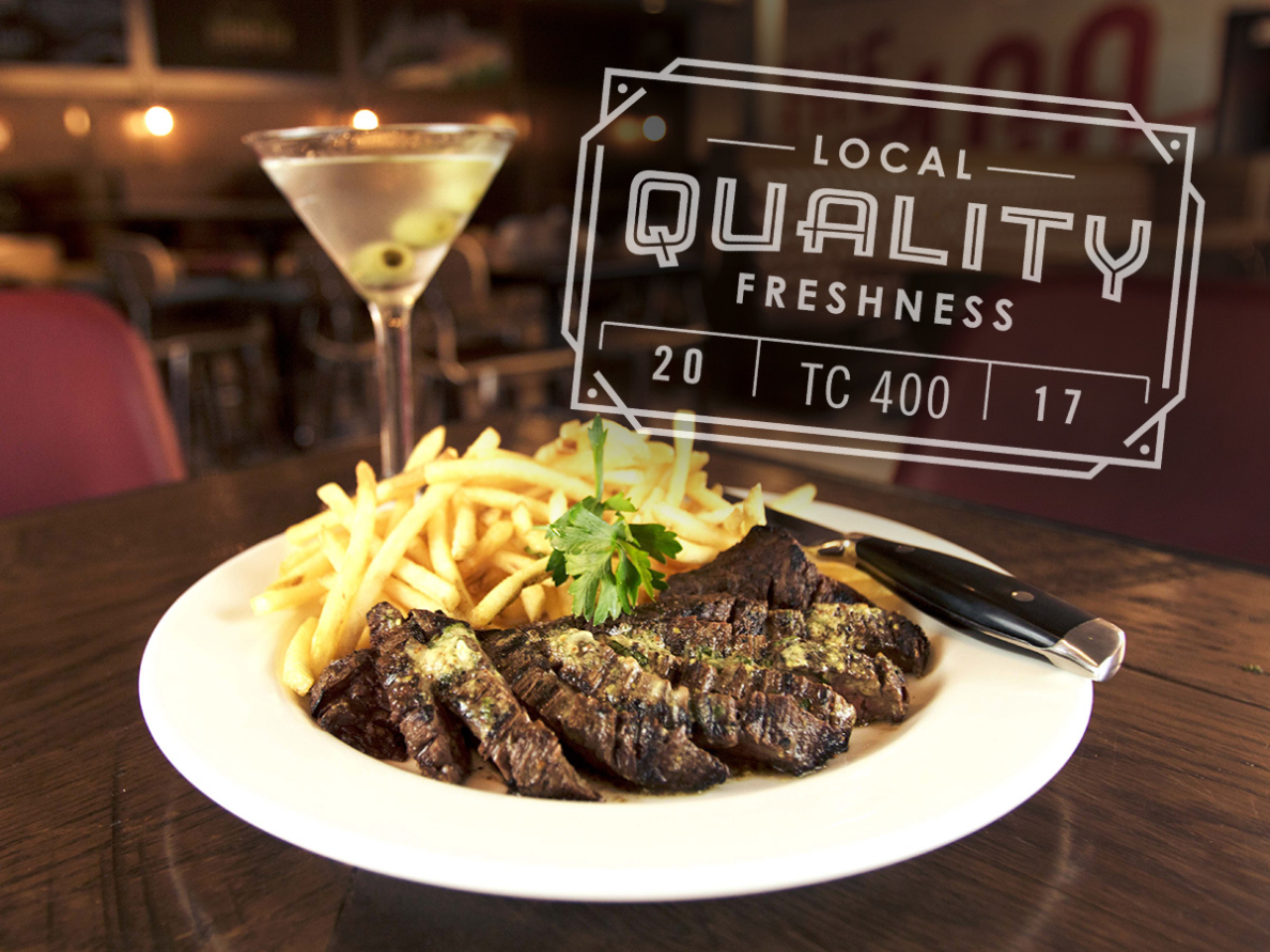
Picking up on typography and graphics associated with Twin Cities 400 train, we developed a “ticket stamp” emblem as a visual signature for the restaurant.
TC400 Quality Stamp
An independent restaurant that’s proudly rooted in the North Country, this casual, come-as-you-are tavern – named after an express train from the 1930s – showcases the unique hospitality and character of the Twin Cities.

Picking up on typography and graphics associated with Twin Cities 400 train, we developed a “ticket stamp” emblem as a visual signature for the restaurant.
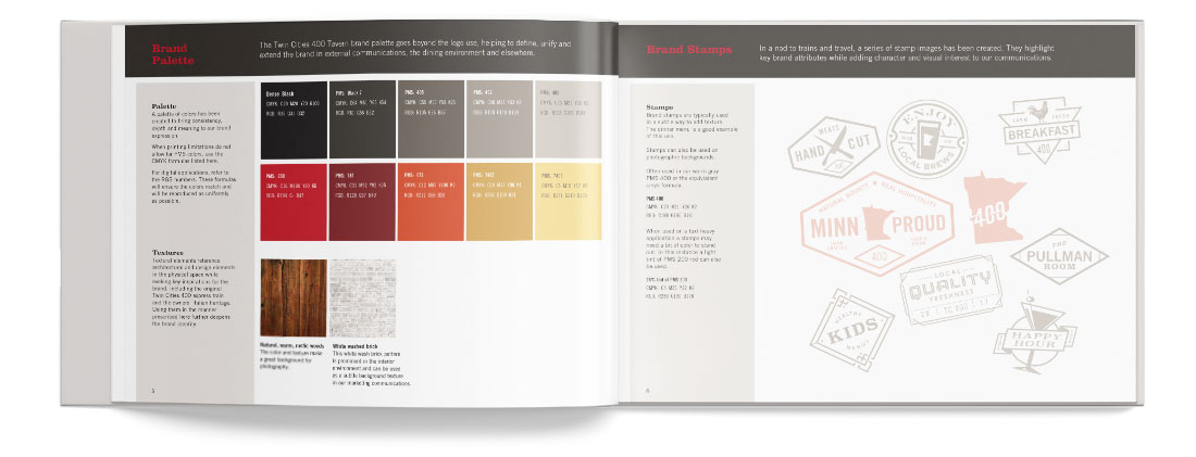
We developed a simple, easy-to-follow brand guide to ensure that all marketing communication maintained a consistent look and feel.
Based on a templated platform, Supervox developed a low-cost but comprehensive and search engine optimized website that provided essential information in the restaurant’s brand voice.
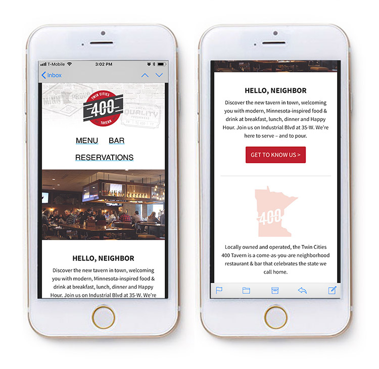
We developed an email template that allows the Twin Cities 400 Tavern to communicate across devices and platforms without compromising brand identity.
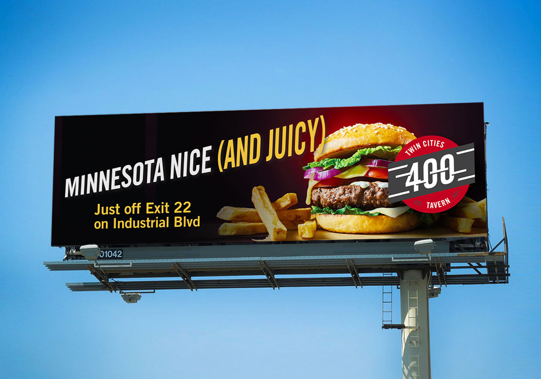
The restaurant’s location, immediately off an interstate, make it an ideal candidate for an impactful, quick-read billboard.
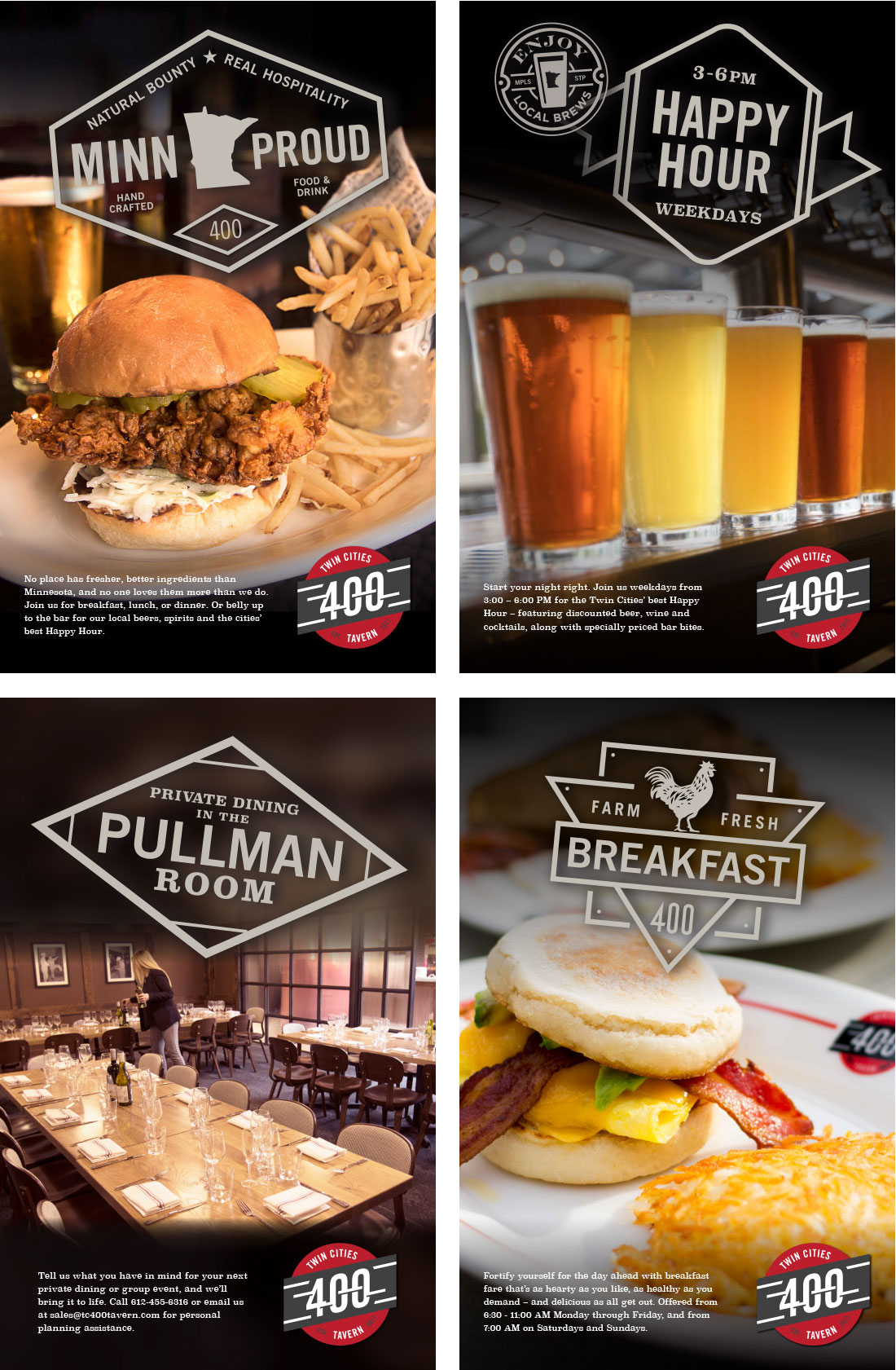
The “ticket stamp” emblem system was easily adapted for a variety of messaging, while establishing a coherent visual language for marketing materials.
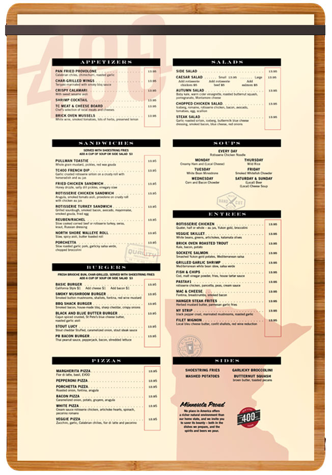
Menus highlighted the restaurant’s local roots, complemented its casual interior, and were easy and inexpensive to update.