The Salut wordmark is classic bistro.
Salut Logo

French restaurants are snooty and expensive. They’re for special occasions and business dinners. The food is fancy and the menus intimidating. The Salut brand countered all of these stereotypes to help deliver on the restaurant’s promise of being “the brasserie down the block.”

The Salut wordmark is classic bistro.
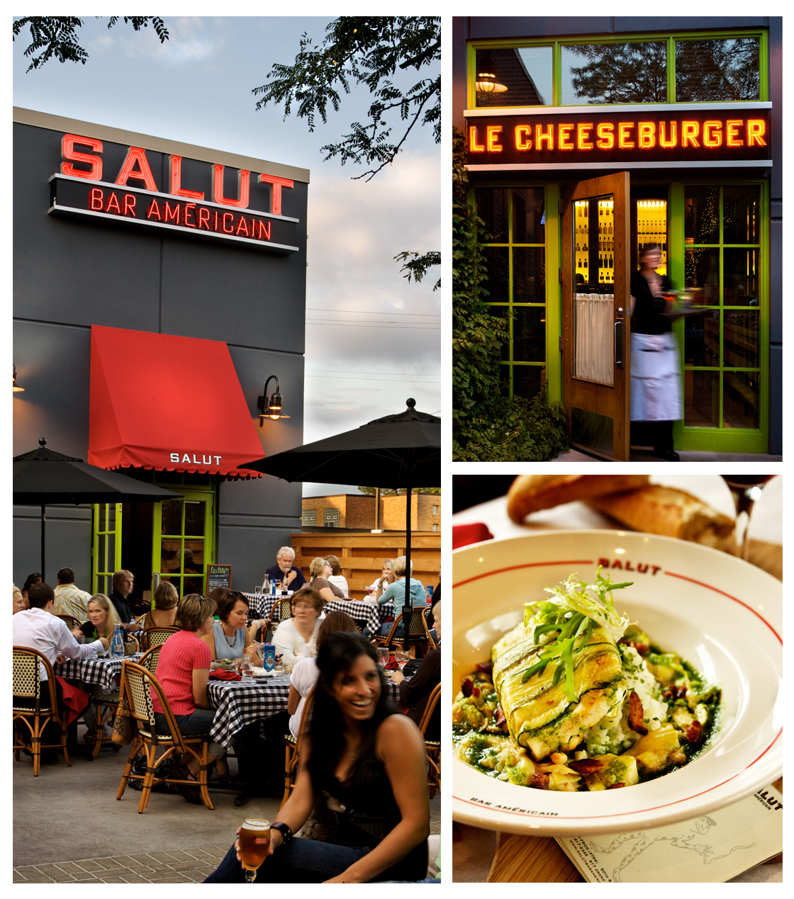
The Salut visual identity encompasses a family of signage treatments.
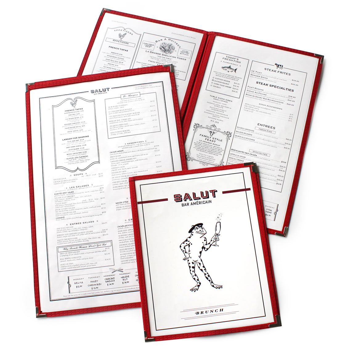
Menus combine classic bistro iconography with the restaurant’s trademark snarky frog.
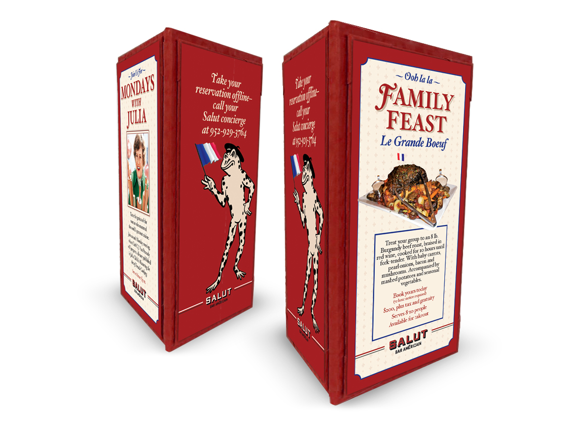
Salut table tents feature two hard-backed, corner-tabbed panels that allow for easy change-out of brand and promotional messaging.
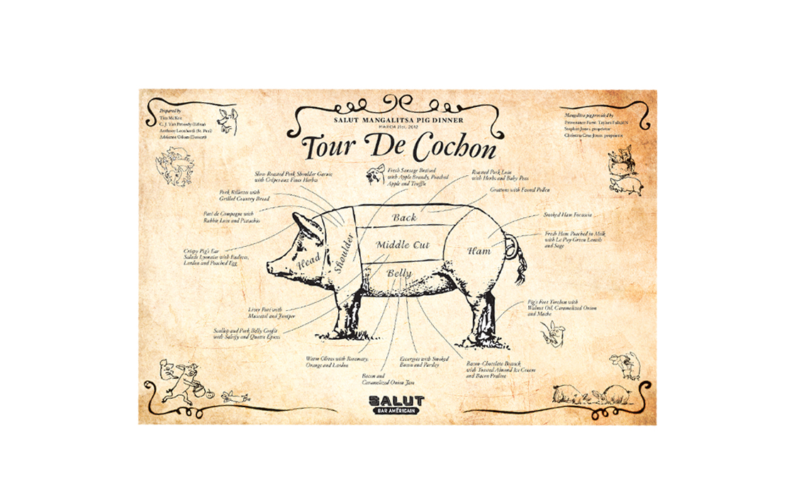
Salut may be a casual bistro, but its kitchen boasts serious talent. This placemat promoted a special, multi-course dinner celebrating the famed Mangalitsa breed of pig.
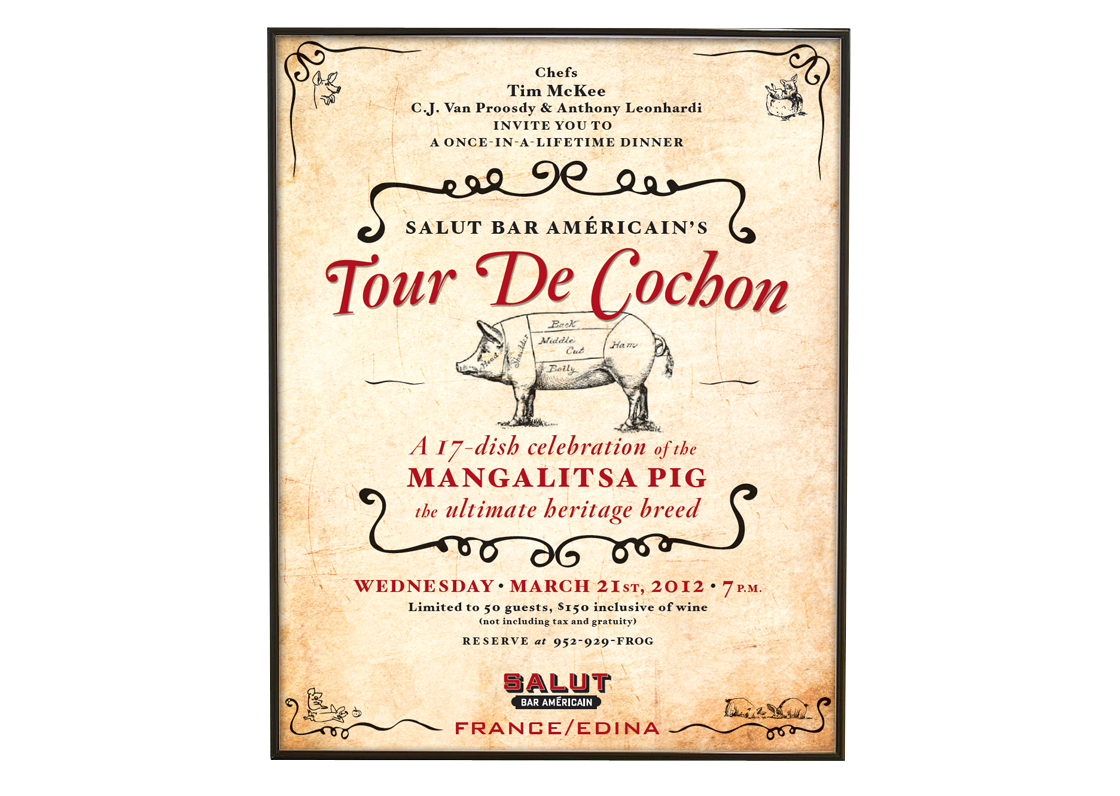
A poster for the Salut’s Mangalitsa pig dinner
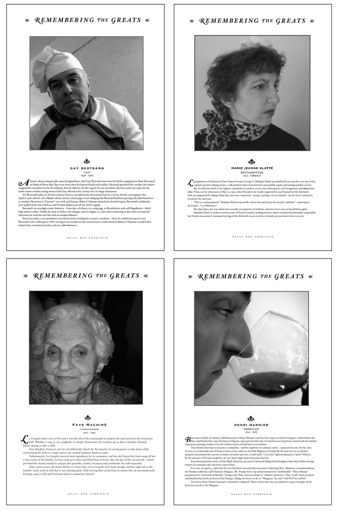
Guest checks arrive inside a small bi-fold presenter bearing the story of a fictional character who died in the service of French cuisine. We created a large collection of these “memorials,” which the restaurant cycles through on a regular basis. Complementing the check presenter inserts, framed, poster-sized versions are found on the walls of women’s room and, above the urinal, in the men’s room.
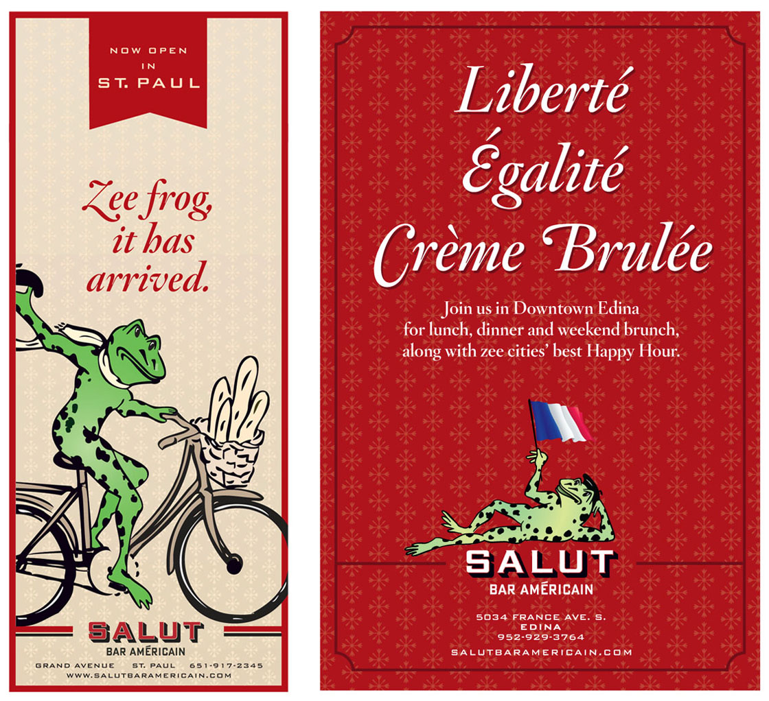
These ads heralded the restaurant’s arrival in chi-chi downtown Edina, Minnesota in a way that communicated its unpretentious nature.
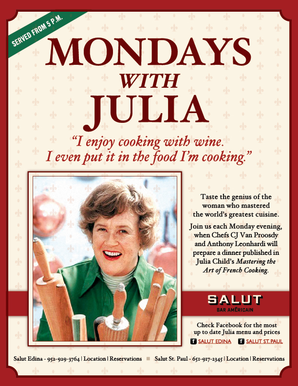
These table tents, also versioned as emails, advertisements and check presenters, all say the same thing: Come to Salut for Monday dinner and each week you can enjoy a recipe from Julia Child’s classic cookbook, Mastering the Art of French Cooking.
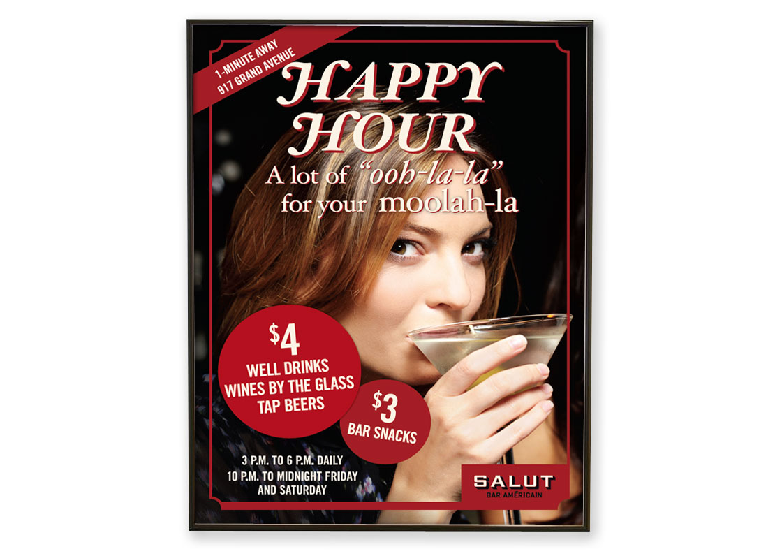
A Happy Hour promotion for Salut was communicated via posters, check presenters, eblasts, table tents and more.
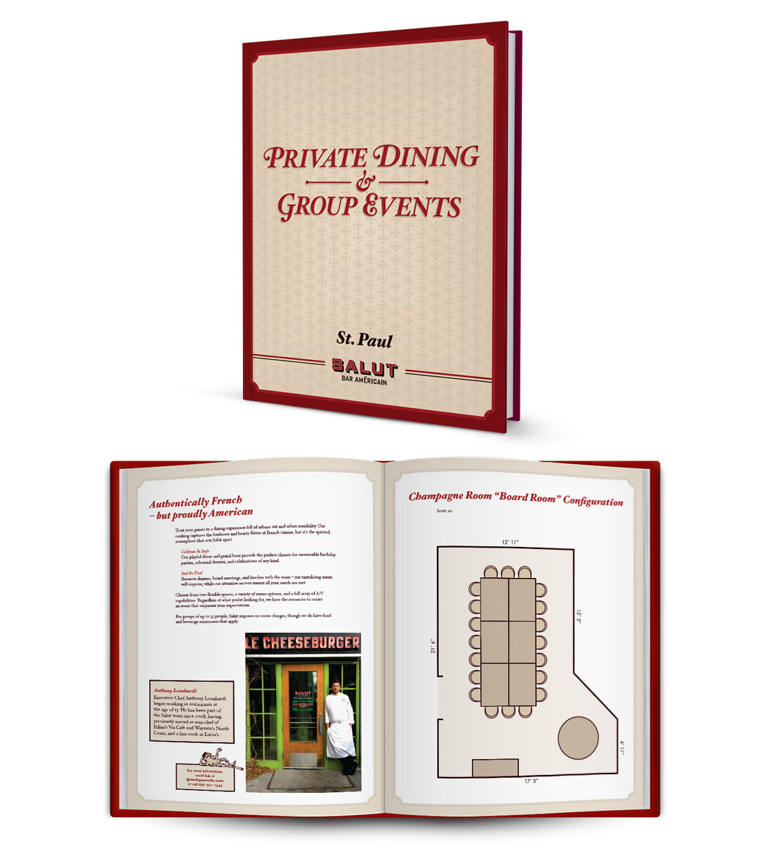
Salut in St. Paul, Minnesota features two private dining rooms for group events.
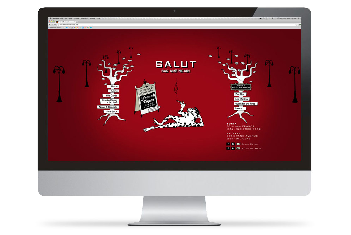
The desktop version of Salut’s website
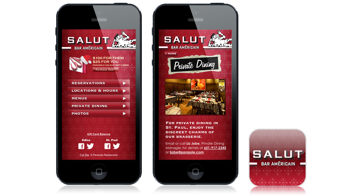
The mobile site makes it easy to eat French on the fly.