The Red Cliff Fish Co. logo expresses the brand in a form that is easily recognizable and powerful. The circle shape is especially apt as it represents the Tribe’s commitment to sustainable harvesting.
Red Cliff Fish Logo

The Red Cliff Band of Lake Superior Chippewa turned to Supervox to brand and market their new fishery and its catch. From naming to packaging and website design, we had a unique opportunity to help establish a business, create jobs, and sustain Tribal culture while introducing wholesale and retail customers to the bounty of the world’s greatest lake.

The Red Cliff Fish Co. logo expresses the brand in a form that is easily recognizable and powerful. The circle shape is especially apt as it represents the Tribe’s commitment to sustainable harvesting.
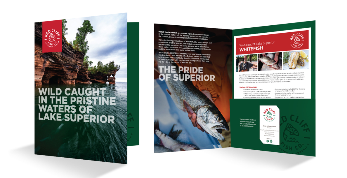
A pocket folder introduces Red Cliff Fish Company to prospective wholesale fish buyers while holding additional informational materials.
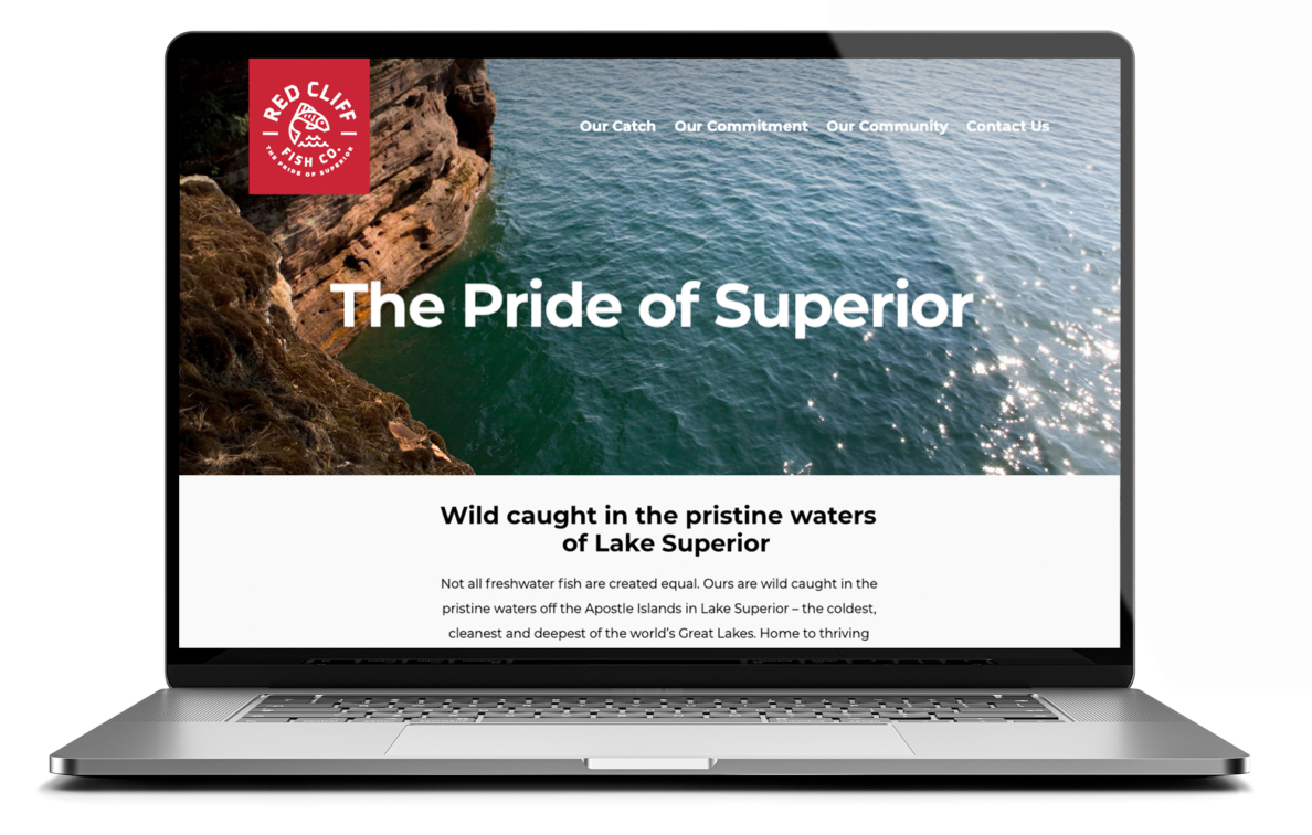
The Red Cliff Fish Company story is simple but powerful, and is reflected in the simplicity and clarity of its messaging.
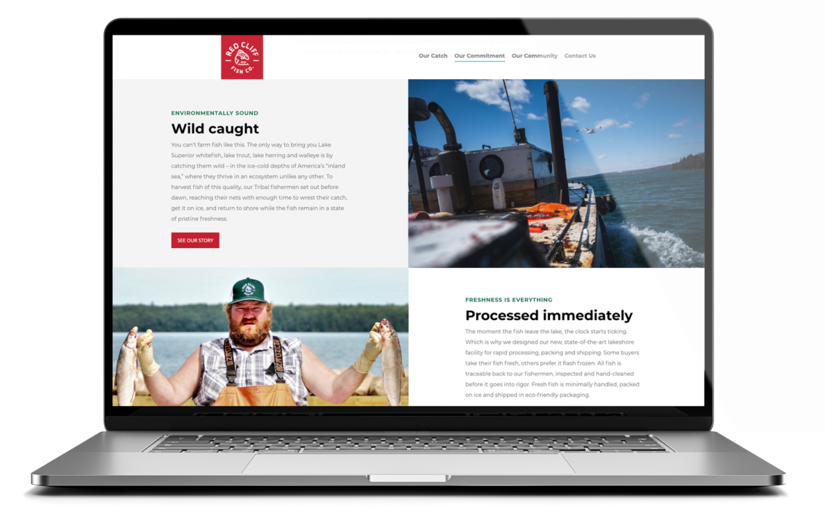
Supervox directed and commissioned the photography that appears on the website and print collateral.
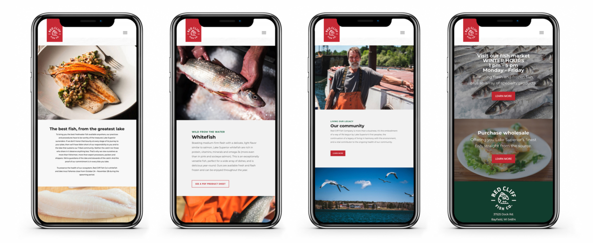
The hub of the brand, the Red Cliff Fish Company website provides essential information about the catch and the Tribe that owns and operates it.
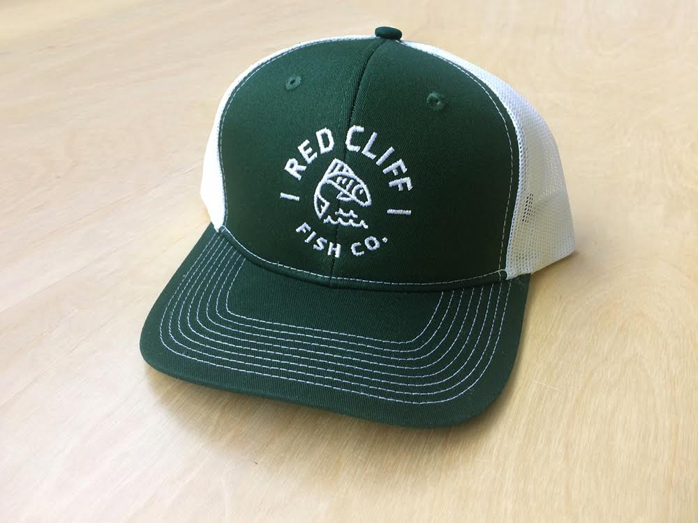
We created a variety of swag, including these popular caps.
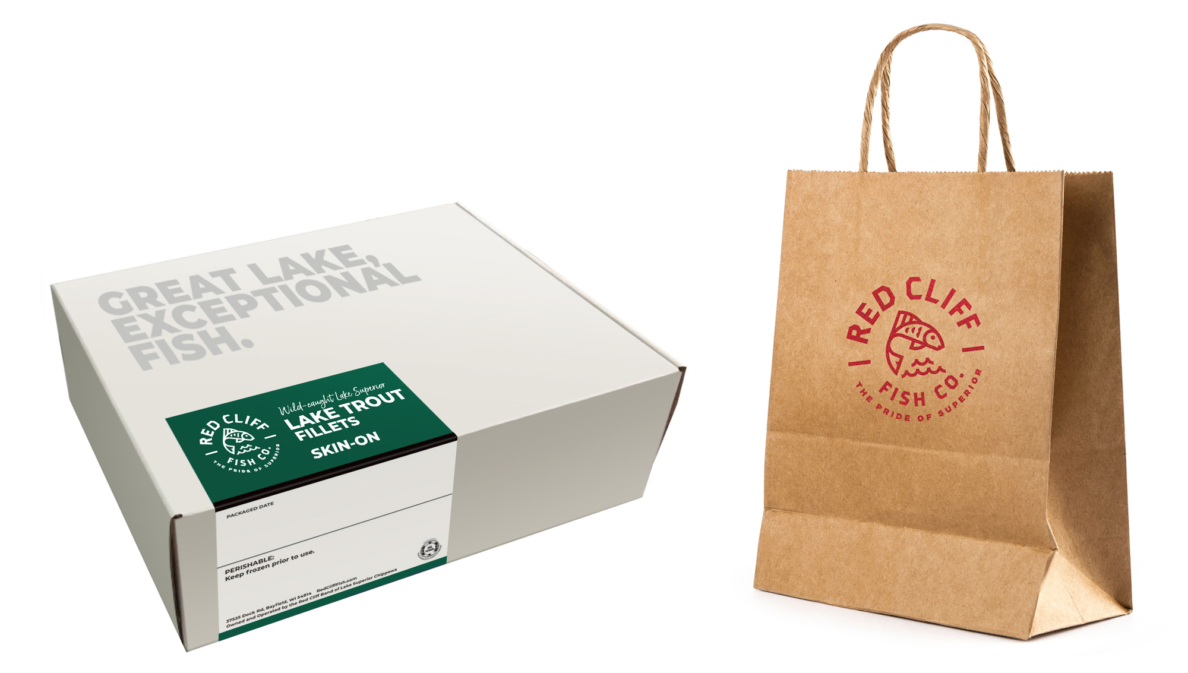
Packaging is an important touch point to communicate the Red Cliff Fish brand.

Van and truck wraps create rolling billboards for Red Cliff Fish Company.