First, the name: “Pittsburgh Blue” refers to steak that’s charred on the outside and raw on the inside. This style of cooking was supposedly born in the steelworks of Pittsburgh, where workers were said to throw steaks directly onto the blast furnaces. The visual identities for Pittsburgh Blue and its separately branded bar, the Blue Tavern, pick up on that lore.

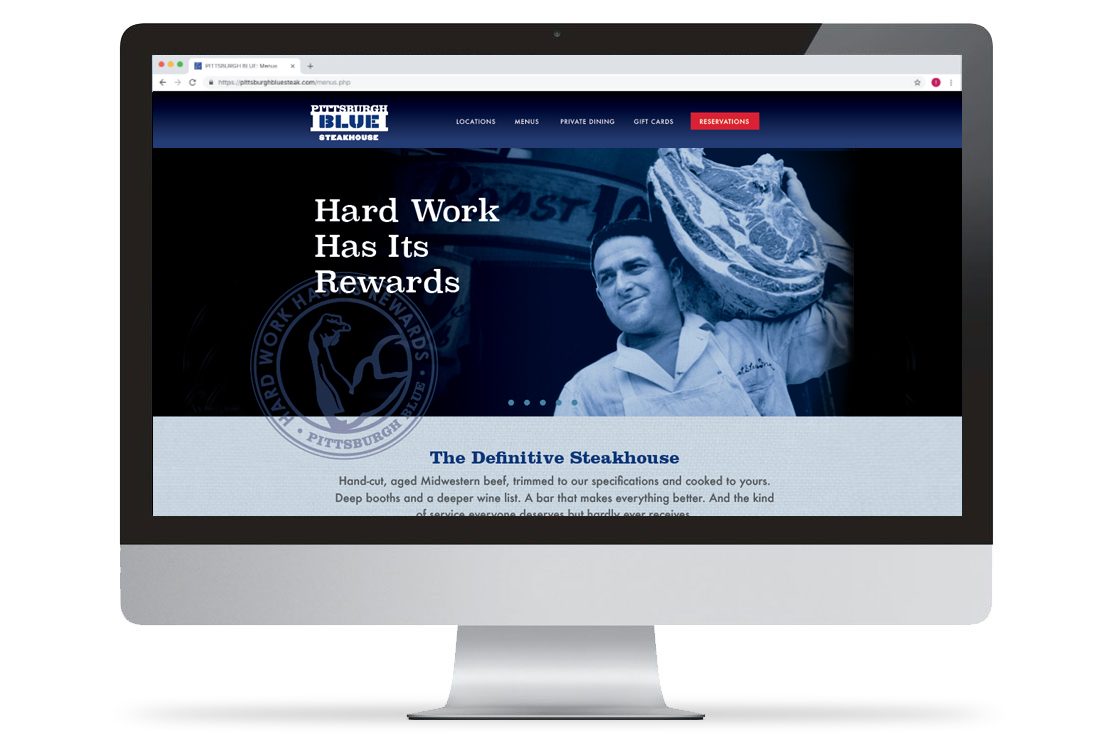
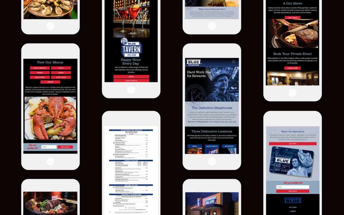
Coinciding with the opening of a third restaurant, we redesigned the website with an eye to location-specific utility – enabling visitors to zero in on their Pittsburgh Blue.

For mobile and desktop users alike, the easily-updatable site provides easy access to key information, while reinforcing brand identity.

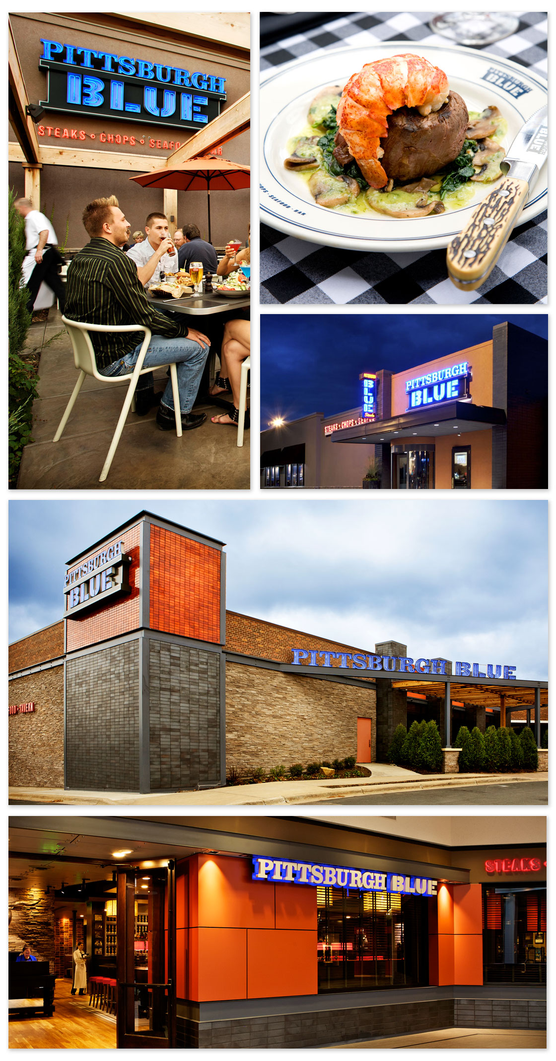
Interior and exterior signage from Pittsburgh Blue at the Galleria mall in Edina, Minnesota.

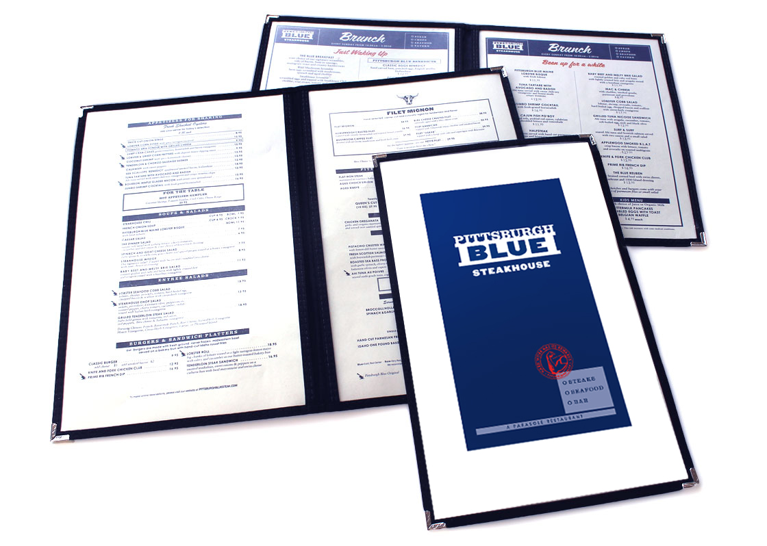
Pittsburgh Blue’s menus, designed within the classic steakhouse vein, can be printed daily onsite.

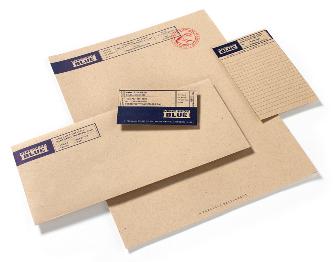
The restaurant’s identity system, like other elements of the brand, reinforces Pittsburgh Blue’s blunt, “working man” aesthetic.

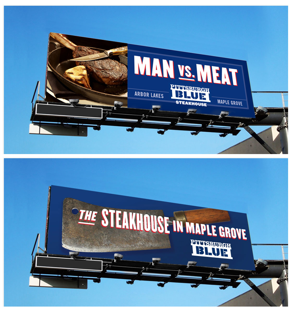
Part of our initial round of advertising, these billboards communicated the concept’s identity from their location on the interstate not far from Pittsburgh Blue’s exit.

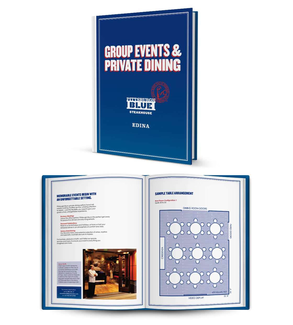
Both Pittsburgh Blue locations host private dining and group events.
