The Mozza Mia logo
Mozza Mia Logos
Imagine that a chef with more passion than cash wanted to open his own place. He’d focus on the food and keep the messaging simple and straightforward. He’d open a Mozza Mia.

The Mozza Mia logo
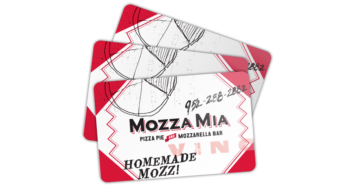
Mozza Mia gift cards incorporate hand-drawn elements to suggest the restaurant’s real focus is on the food, not the marketing.
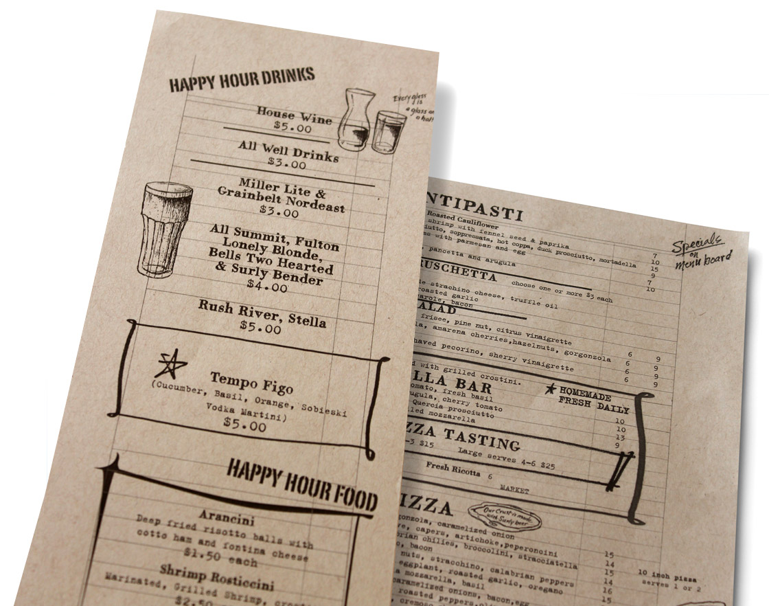
Printed on craft paper to suggest that they do double duty as placemats, Mozza Mia Menus feature a combination of type and handwritten-style illustrations.
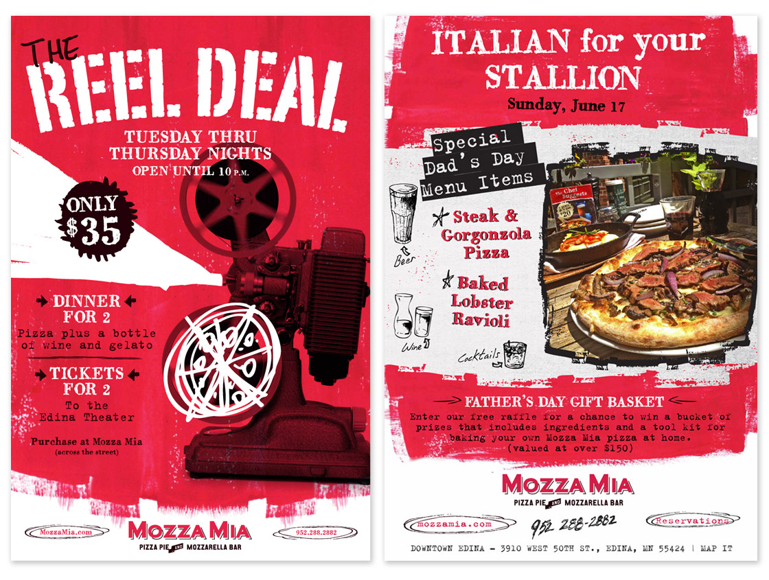
The posters’ hastily-assembled quality suggests that the owners’ real skills are on display in the kitchen.
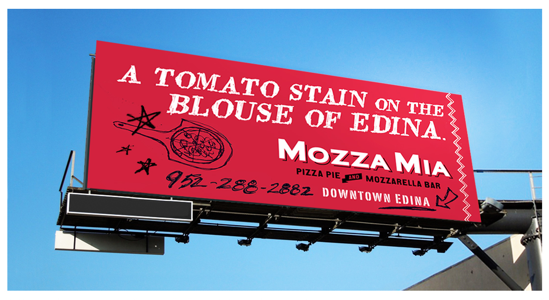
A billboard announcing the restaurant’s opening
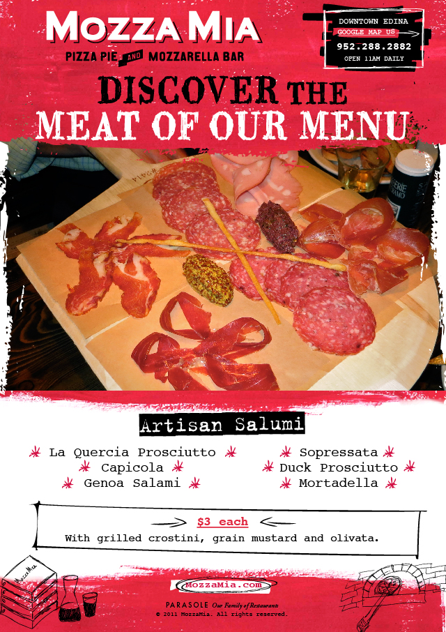
An example of Mozza Mia’s eblast style
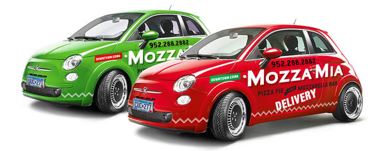
What better delivery vehicle – for food and messaging – than a zippy little Fiat?
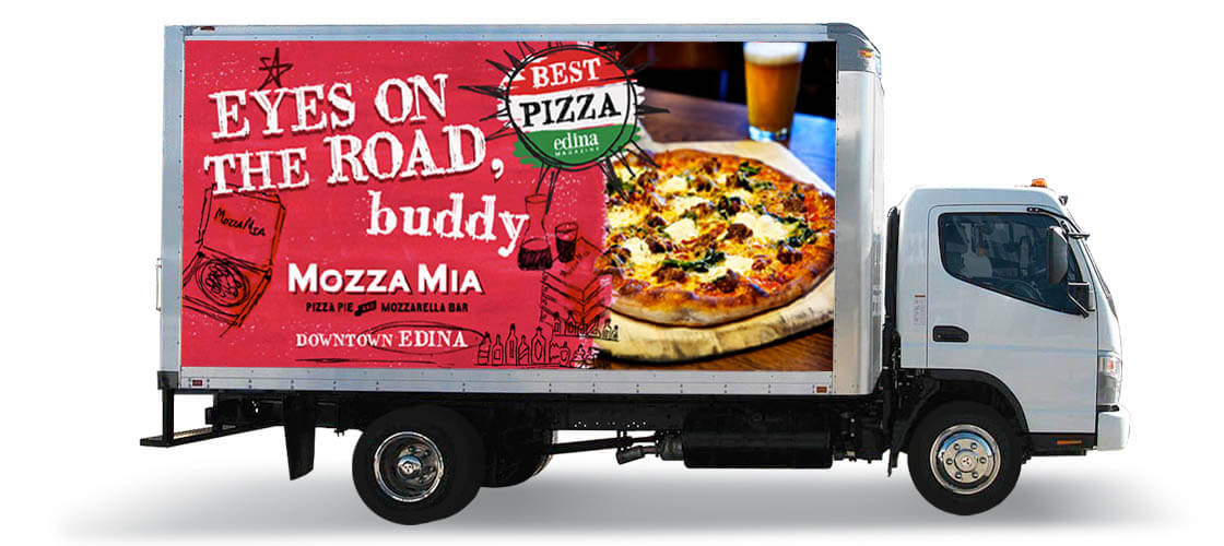
Mobile advertising isn’t always on a smartphone. This messaging for Mozza Mia appeared on the side of the Parasole Restaurant Holding’s bakery delivery truck.
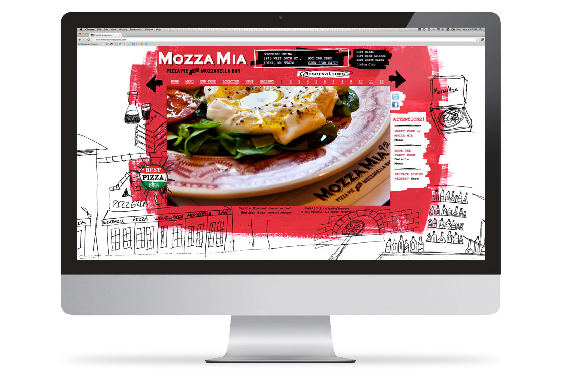
The website juxtaposes professional photography with illustrations that could have been sketched on a napkin — actually, WERE sketched on a napkin.
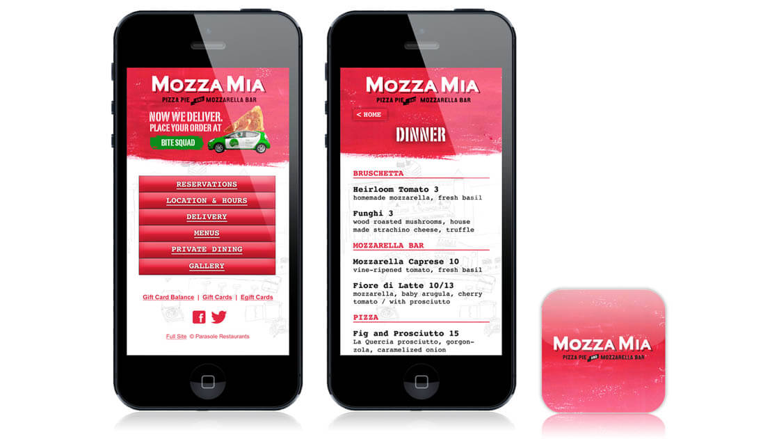
Mozza Mia’s mobile site provides quick access to essential information.