Real men don’t like fussy, frilly logos.
Manny’s logo

Movers, shakers and deal-makers have elevated Manny’s to the very top of the food chain, but the power of this iconic steakhouse’s brand lies in the way it lets everyone else know that they’re welcome, too.

Real men don’t like fussy, frilly logos.
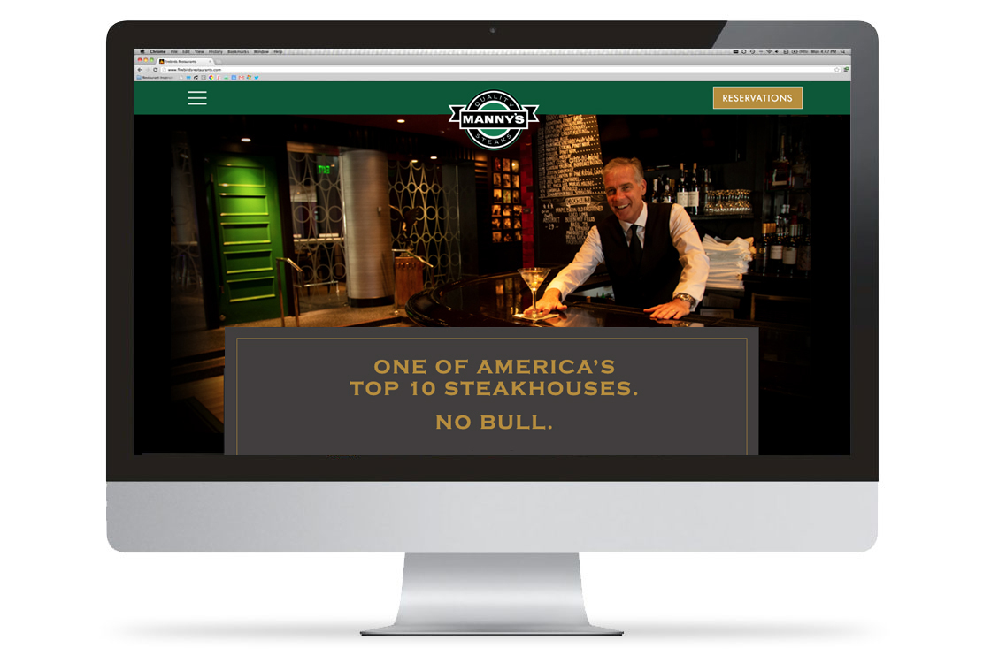
Now in its third generation, the restaurant’s new website telegraphs the rich Manny’s experience while providing essential information quickly and intuitively.
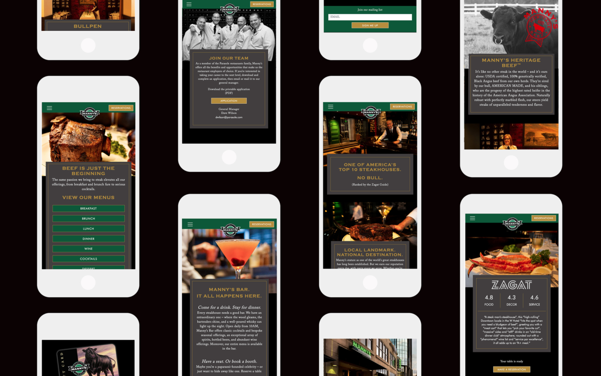
Manny’s mobile-optimized site makes it easy for a new generation of steak eaters to get the information they need on the platforms of their choice.
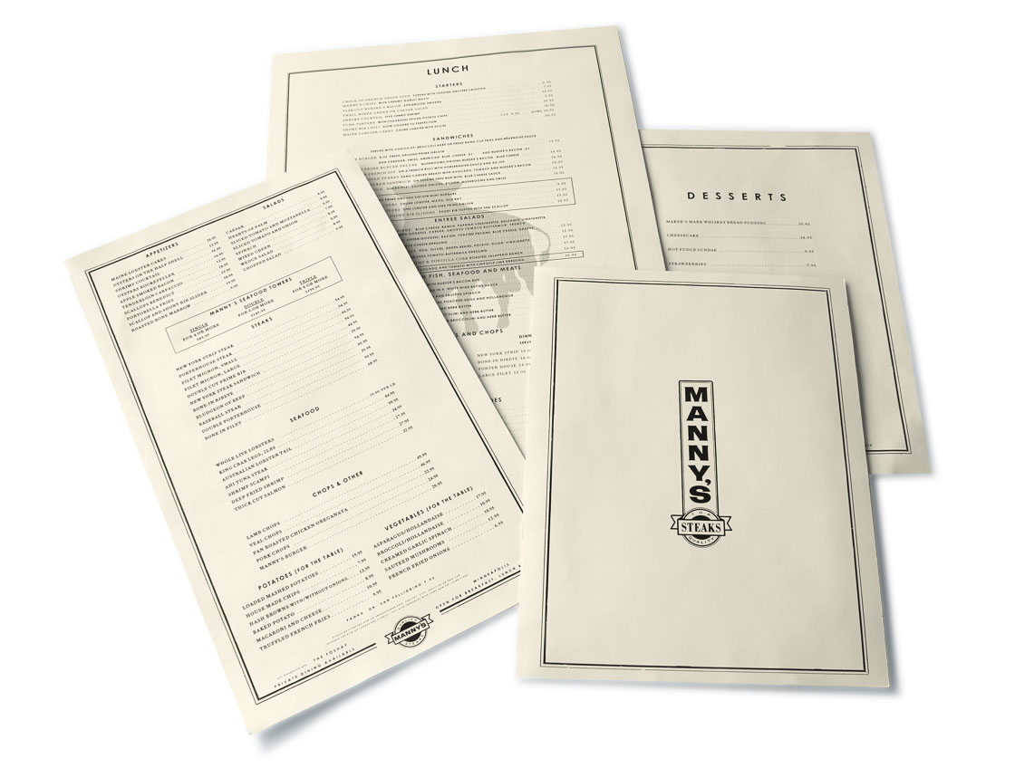
Menus are in the tradition of the classic New York-style steakhouse.
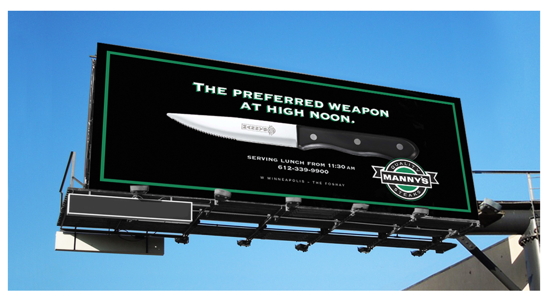
Once a dinner-only restaurant, Manny’s began serving lunch and breakfast when it moved to the W Minneapolis – The Foshay hotel in 2008.
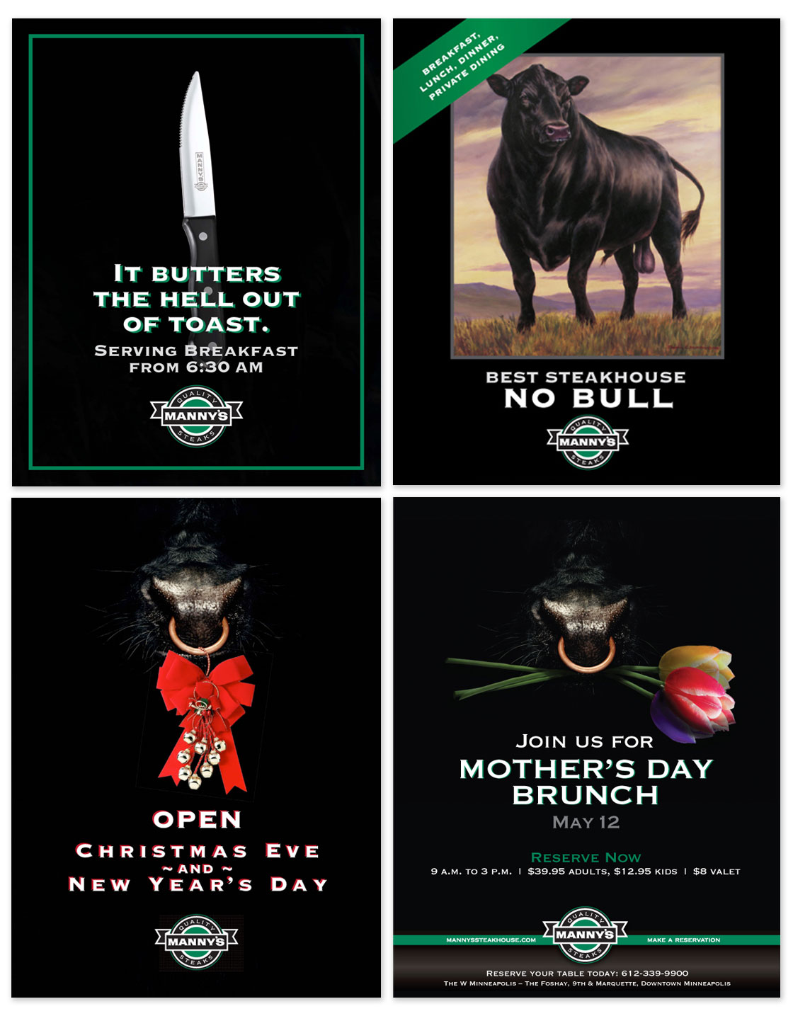
Print ads also doubled as guest check inserts, postcards and posters that were displayed on easels in the Manny’s foyer.
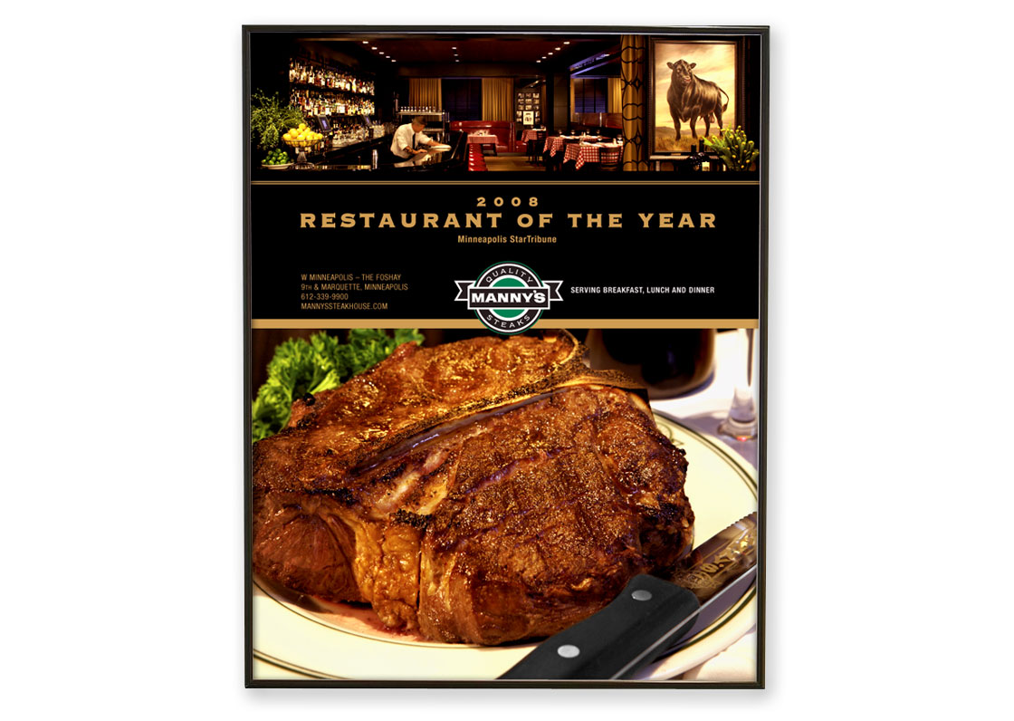
Another print ad, this one featuring a glimpse of the restaurant’s interior at its then new location in the Foshay Tower.