Asked to make the existing logo more whimsical, we redrew the existing art and enhanced it with color and new typography. The resulting design works harder than ever while effortlessly commanding attention.
Mad Hatter Logo

When the owner of the Alice in Wonderland-themed Mad Hatter Restaurant and Tea House called to see if we might help with a logo refresh and some packaging design, we got “curiouser and curiouser.” Good thing we heeded our desire to say yes. It wasn’t our biggest undertaking, but working with the Mad Hatter’s passionately committed proprietors made this one of our most engaging projects.

Asked to make the existing logo more whimsical, we redrew the existing art and enhanced it with color and new typography. The resulting design works harder than ever while effortlessly commanding attention.

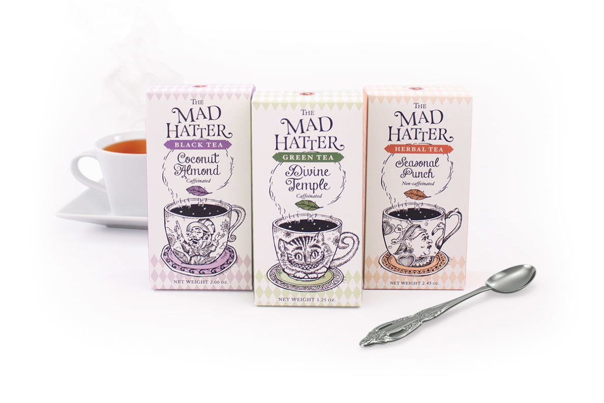
New packaging for Mad Hatter loose leaf teas features original illustrations of iconic characters from Alice in Wonderland. What made this project even more fun was the truly remarkable quality of the teas themselves – “sourced and blended with positively maniacal zeal to delight even the most dementedly discerning connoisseur.”

“You could drive yourself batty trying to devise a recipe for scones as delicious as these,” says our packaging for these classic tea accompaniments, “but why bother, when the secret is right inside?”