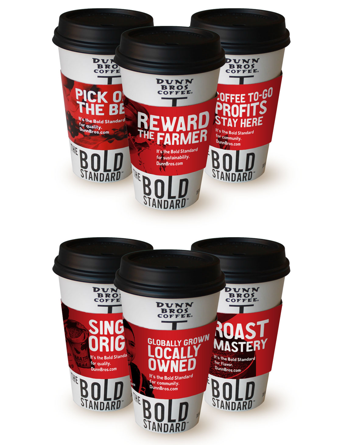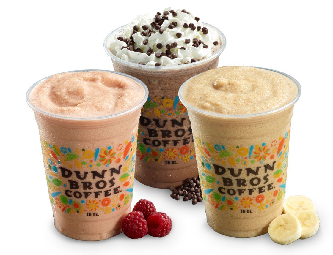
To-go cups and sleeves worked together in a unified graphic. The use of emphatic colors, shapes and type helped to create a visual identity that united the stores, which had varying decor styles. The initial brand rollout featured a number of sleeve designs, each highlighting one of Dunn Brothers’ core principles.

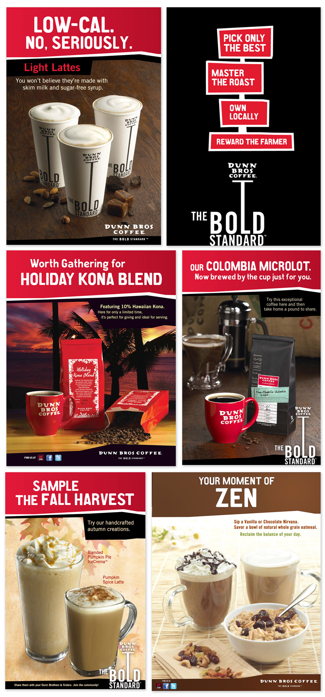
Promotional posters and ads reflect our strategy of creating a trademark Dunn Brothers look that could help unify the stores’ disparate interiors.

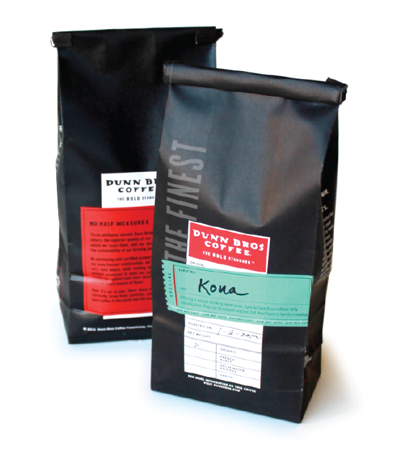
Departing dramatically from the brown paper bags Dunn Brothers had used previously, coffee bean packaging featured a white area for the date the coffee was roasted. We also created a system of stickers, color coded by coffee region, on which the barrista could write the specific type and origin of bean, and then affix to the bag.

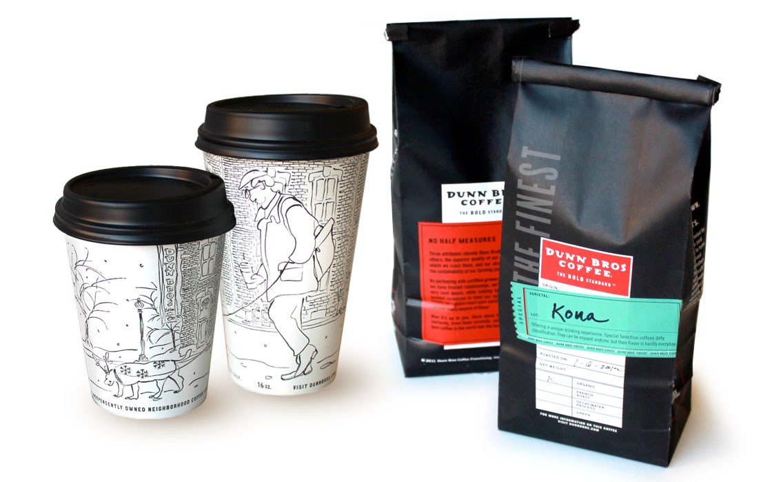
We also created seasonal to-go cups.

Each summer, we created a new cup design for Dunn Brothers’ new warm weather creations.

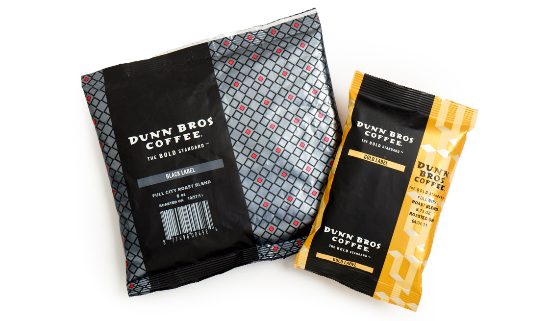
We also created packaging for the sale of Dunn Brothers office coffees.

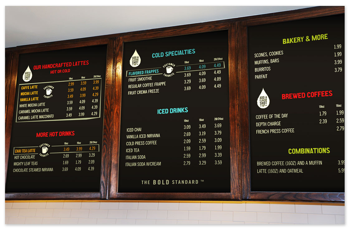
One design feature shared by all Dunn Brothers locations: Their menu boards.

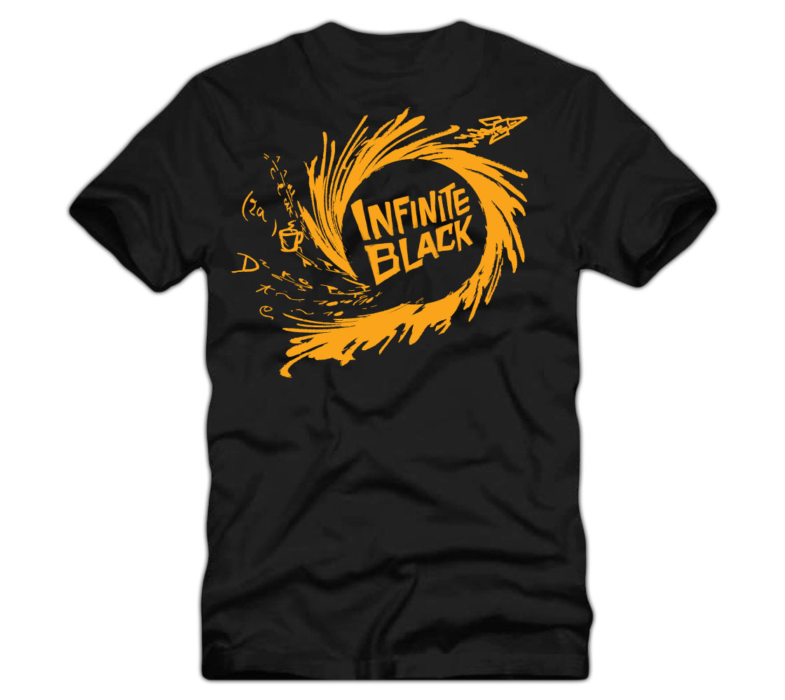
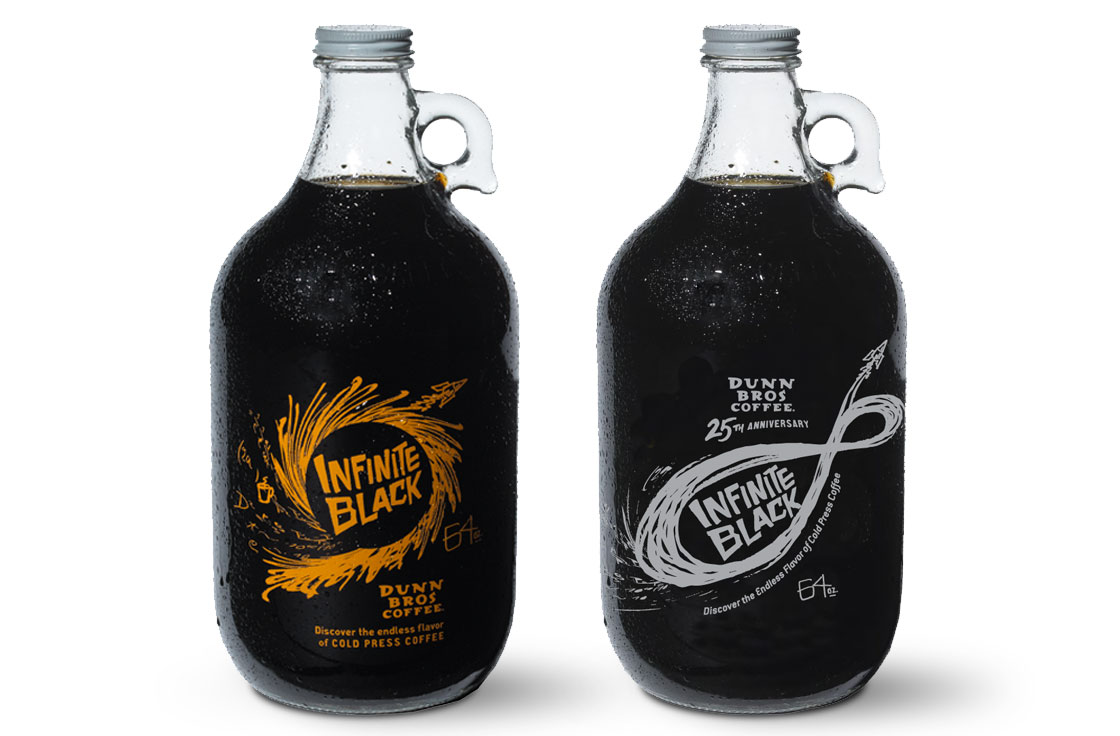
We created the Dunn Brothers brand of cold-pressed coffee, Infinite Black. T-shirts helped to introduce the new product.

Dunn Brothers’ Infinite Black cold-pressed coffee was a pioneer in the use of growlers for non-beer beverages.

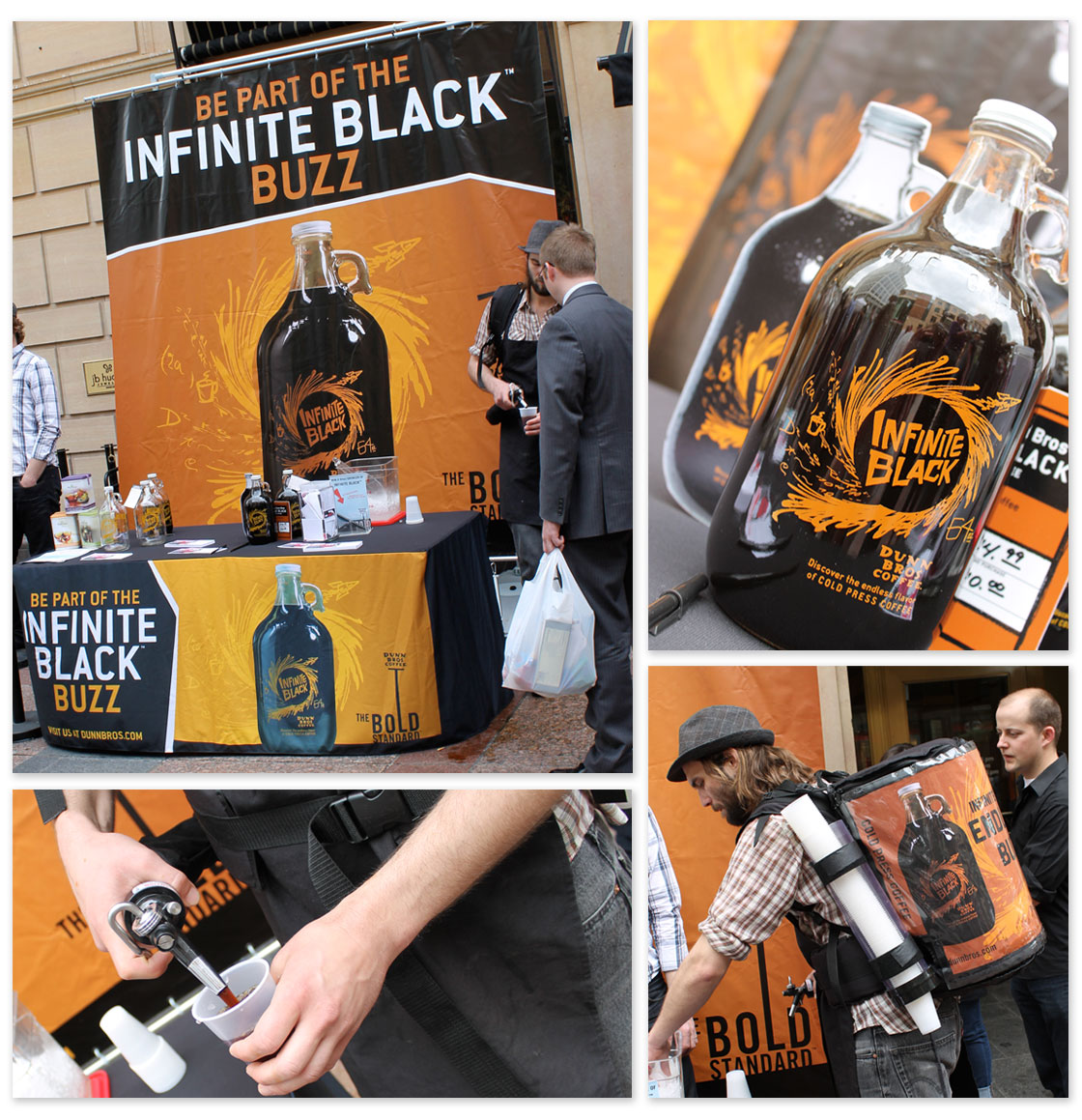
Scenes from the launch of Infinite Black cold pressed coffee.

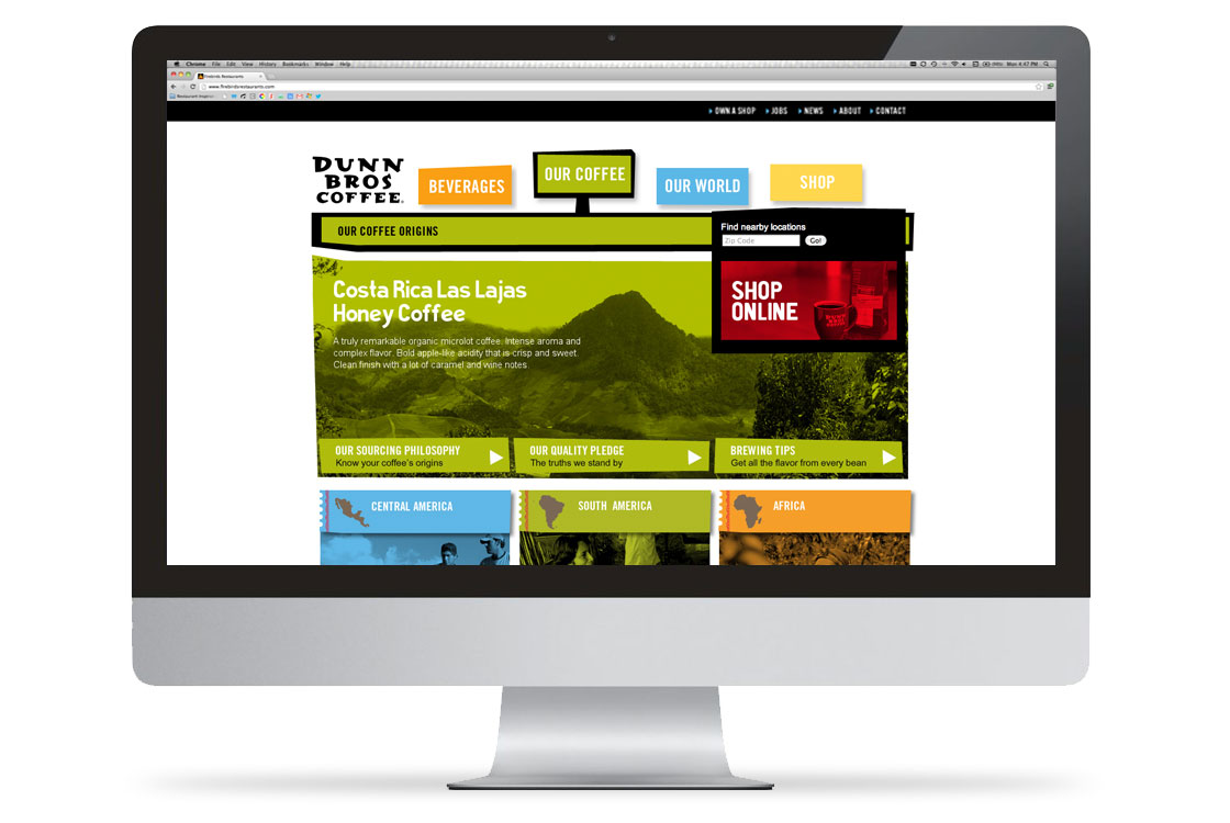
Supervox created a new website for Dunn Brothers. Among its features: a comprehensive, highly educational guide to the company’s coffees.

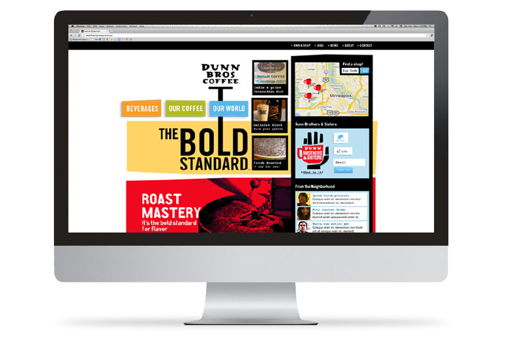
The new website enabled quick and easy access to location and loyalty program information, as well as details about coffees and drinks.

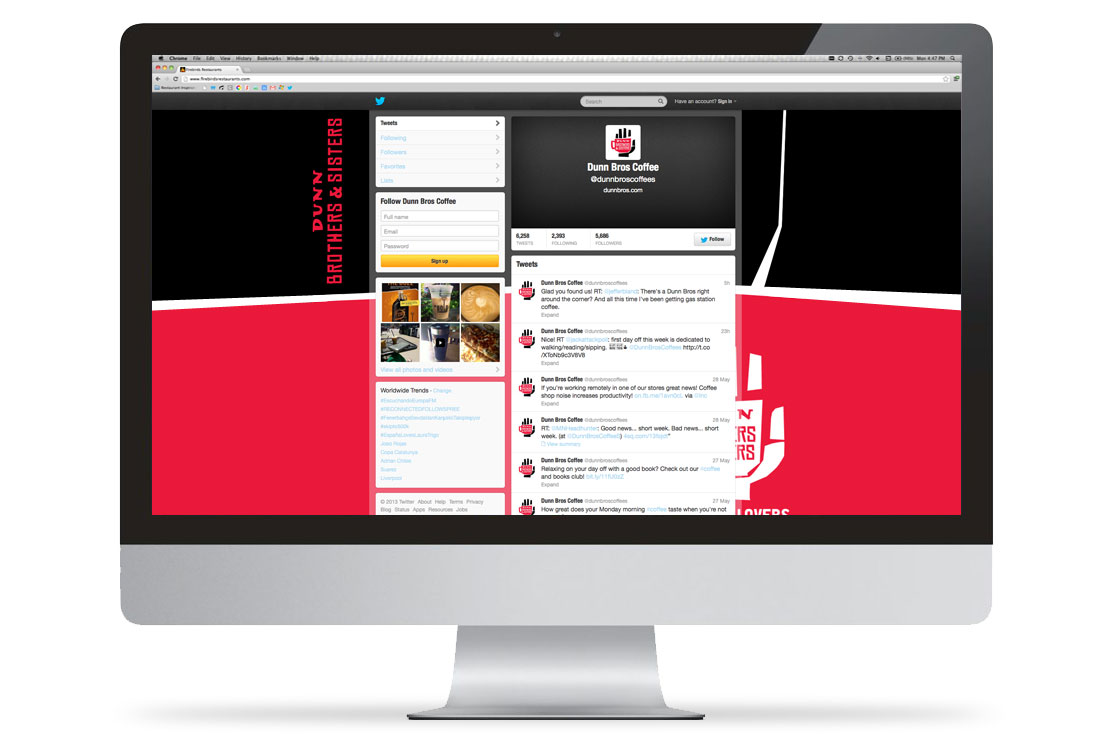
Supervox created the Dunn Brothers & Sisters loyalty program and twitter feed design that allowed members to stay in touch.
